Welcome to slider editor documentation
Here you can find documentation how to use slider editor.
Slides
On the bottom left of the editing page you can manage the slides and change their settings.
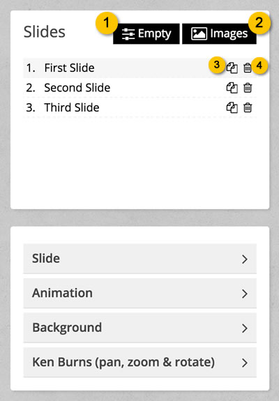
To add a new slide you have two options. By clicking on the Empty button (position 1) a new empty (without background) will be added in the last position, while the Images button (position 2) allows you to select one image from a file manager. You can change the slide positions by dragging and dropping them. The two icons on the righe of each line allows you to duplicate a slide with all its settings and elements (position 3) and to delete it (position 4).
The panels below allows you to edit the slide settings as described below.
Slide Settings
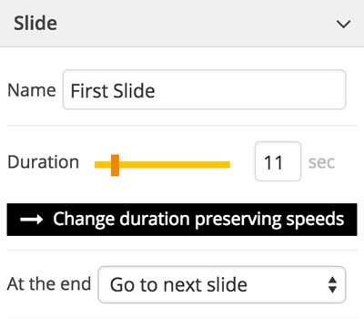
This panel allows you to change the general settings of the slide.
- Name: the name of the slide that is shown in the slide list above
- Duration: how long the slide will be visible after its enter animation
- At the end: you can choose between Go to next slide (at the end of the duration time the next slide will be shown) and Do nothing (nothing will happen after the duration time)
Since the element time on screen and their effect speeds depends on the slide duration, when you change it the element speeds are re-computed base on the new value (see the Elements paragraph for more details about element speed). The button Change duration preserving speeds allows you to change the slide duration without affecting the element speeds.
Animation
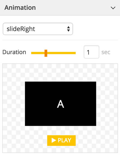
This panel allows you to specify how the slider will be shown. You can choose one of the ready-to-use effects and its duration (you can also enter decimal values separated by comma). A realtime preview will be shown below.
If you choose the none effect or if you specify a zero duration, no effect will be appied to the slide.
Background
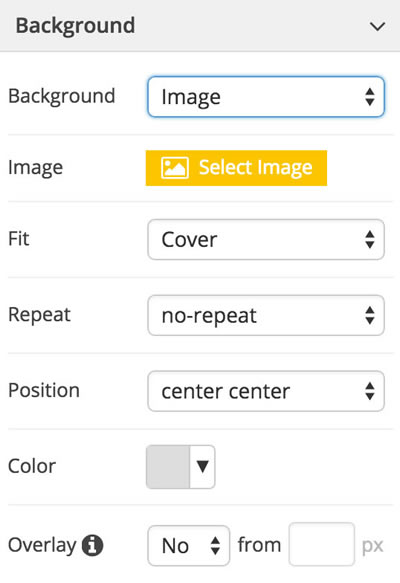
In this panel you can find the background settings of the slide. You can choose between a transparent background, a solid color, an image (you will be prompted to select an image in a file manager folder) or an image loaded from an external url.
If you choose the Image or External Url options some settings will be shown. They allow you to specify how the background image will be placed and resized. The first property is Fit with the following available values:
- None: the image will never be resized
- Contain: the image is alway fully visible, but blank spaces may be shown
- Cover: the image will always cover the slider, but some parts may be hided
The Position property controls how your image is positioned inside the slide.
Even if you choose a background image, you can still selecting a background color. This could be useful if your image has transparent parts.
The Overlay setting could be very useful if you have low quality or small size image. In this case, if your slider is responsive your image could be stretched to higher dimensions and shown with poor quality. If you enable this property a pixelated overlay is placed over the background image reducing that effect. You can also choose to show the overlay when the slide width exceeds a certain value. Leave it blank if you wish it to be always visible.
Ken Burns Effect
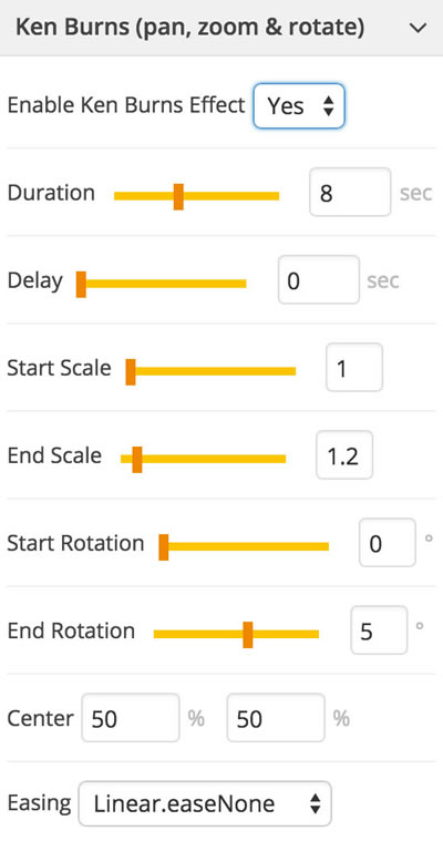
This panel allows you to enable the Ken Burns Effect (open Wikipedia) on your background image (if you select a transparent or solid color background you won't see this settings). It applies a smooth and continuous effect (pan, zoom, rotation) to your image creating a very impactful experience.
- Duration: usually you should set the same duration as the slide
- Delay: a time to wait for before starting the effect
- Start/End Scale: the start/end zoom parameters. If, for example, you wish to start from the original size and zooming the starting value should be 1 and the end one a bit more (i.e. 1.2)
- Start/End Rotation: these values affects the rotation of the image. You should use low values near zero
- Center: the zoom center. If you choose 50% values the image is always centered while zooming (you will see the center of the image coming to you). But if you choose different values you will see a sort of pan effect. For example, choosing 0% 0% the image will be scaled having the top left point as the center. So while zooming you'll see the image moving to the right bottom
- Easing: the effect easing (see the Ease Visualizer for more details). Usually Linear.easeNone and Power1.easeIn grant the best visual experience
Elements
On the bottom right of the editing page you can manage the elements of the current selected slide.
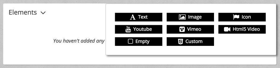
By clicking the Add Element button you will be prompted to select the element type, as show in the picture below.
After adding some elements they are shown in the main timeline as show below.
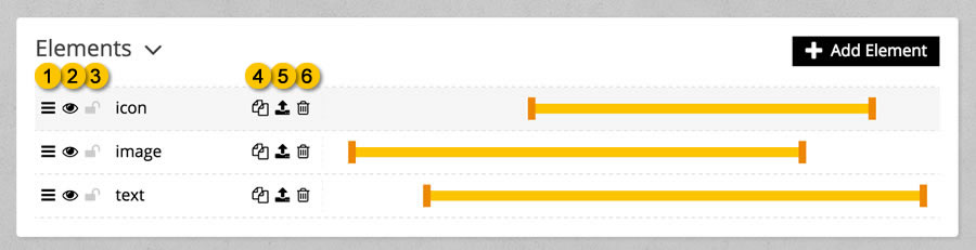
The icon number 1 allows you to sort the element as you prefer by dragging them to another position. The element positions reflect how thei are positioned in the slide. This means that an element with a higher position will be placed over the ones with a lower position.
By clicking the icon number 2 you can show/hide an element on screen, while icon numer 3 allow you to lock it, avoiding it to be dragged ed edited.
Icons number 4, 5 and 6 can be used to duplicate an element, copy an element to another slide (a popup will ask you to select the destination slide) and to delete it.
By dragging the orange pins on the sides of the yellow bar you can control when the element will be shown and how long it will stay on the scene before being hided. You can see the details (in seconds) in the Element panel described below. These times are base on the slide duration. If, for example, the current slider has a 10 second duration and your yellow bar has a full width, the element will be shown as soon as the slide appears and it will stay on the scene for the entire slide duration. If instead you drag the left pin to the middle, the element will appear after 5 seconds (50% of the slide duration).
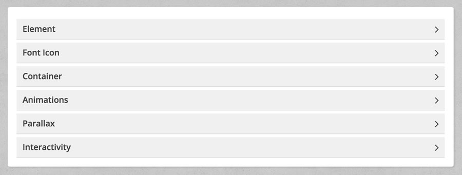
As show in the above picture, below the main timeline you can find some panels that allow you to control the element settings. Some of them are common to all types of elements, while others are specific for each type.
Common Panels: Specific Panels:- Text Element Type
- Image Element Type
- Font Icon Element Type
- Youtube Element Type
- Vimeo Element Type
- Html5 Video Element Type
- Empty Element Type
- Custom Element Type
Element Basic Settings
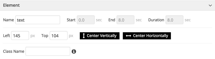
Inside this panel you can find some basic settings. The element name is used only inside the element list and it could be useful to identify them. Start, End and Duration are the linked to the yellow bar and show you when the element comes into the scene and when it leaves it. In the second line you can find the element position inside the slide. You can change those values manually or dragging the element in the editor. We've also provided you with two useful buttons to quickly center the element horizontally and vertically. The Class Name input allows you to specify a custom class name to be added to the element.
Element Container
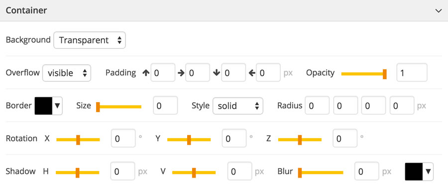
Each element has its container that is a standard div element with its own settings.
- Background: the container can have a transparent background, a solid color or an image. If you choose image or external url some other settings will be show:
- Background Fit: how the image have to be resized accorgin to the container dimensions. none means that the image will never be resized, with contain the image is alway fully visible but blank spaces may be shown, while with cover the image will always cover the slider, but some parts may be hided
- Repeat: it's useful for repeteable patterns. You can choose to repeat the image horizontally (repeat-x), vertically (repeat-y), in both directions (repeat). If you choose the no-repeat value (the default one) the image will never be repeated
- Position: it controls how your image is positioned inside the slide. Even if you choose a background image, you can still selecting a background color. This could be useful if your image has transparent parts
- Overflow: if set to yes what it's outside the container won't be shown
- Padding: the inner margin of the container
- Opacity: a value between 0 (not visible) and 1 (fully visible) for transparency
- Border: the container border size (in pixel), its style (solid, dotted, etc.) and its radius (for rounded borders - insert a value in pixel)
- Rotations: the container can be rotated along each 3d axe
- Shadow: it allows you to specify the shadow horizontal size (Shadow H), the vertical size (Shadow V), the blur amount and the shadow color
Animations
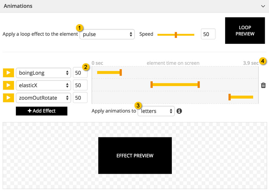
The extension already comes with a lot of ready-to-use animations that allows you to create stunning sliders.
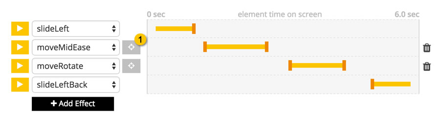
On top of the panel you can see the loop effects (position 1) that can be applied to elements and they are always in play. The Speed parameter specify the effect velocity.
Below you can find a new timeline where you can specify how the element appers into the scene, what happens during the slide execution and how it leaves the slide. As you can see, when you add a new element to a slide, three default effects are already there. The first one is the enter effect that can be used to make the element enter the scene with an animation. For this effect you can only change its duration by dragging the right pin.
The last one is the opposite, i.e. the exit effect. Its duration can be changed dragging the left pin.
In the middle you can place as many effects as you wish. This kind of effects allows the element to move, pulse, rotate, flash, etc. (try changing effect and see the result inside the preview box) during the slide execution. For these effects you can specify the start and end points.
An example
To better understand how these effects work, let's consider a simple example. Suppose that the current slide has a 20 seconds duration and that the current element enters after 5 seconds and exits 10 seconds later (5 seconds before the slide exits). Now on the top right of the effect timeline (poistion 4) you'll see 10 seconds. This means that the element time on screen is 10 seconds. So, for example, if we drag the right pin of the enter effect to the middle of the timeline the enter effects duration is set to 5 seconds (half the element time on screen). And the same for the other effects.
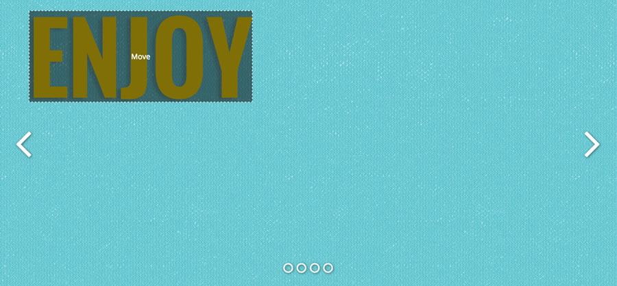
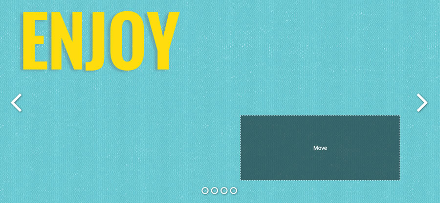
Moving elements from a point to another
The slider allows you to move elements from a point to another. If you open the effects select of one of the effects in the middle, you can see that some of them starts with the move keyword. If you select one of them a new button containing a terget icon will be show (position 1) as you can see in the picture below.
If you click on that button, a new div containing the text "MOVE" will be placed over you element. Move it to your desired end position and the element will be move along that path.
Step 1 - before clicking on the target button
 Step 2 - by clicking on the target button a new div is shown
 Step 3 - drag the div to the end position
You can repeat this process as many times as you want, chaining more than one move animations.
Text Splitting
If you are editing the animations of a text element the option at position 3 is shown. It allows you to specify if all the timeline effects have to be applied to the entire text (the default option), to letters, words or lines. In the last three cases the text is splitted into letters, words or lines and the animations are applied to each text part with a delay between them. This delay can be set filling in the field at position 2 with a value between 0 and 100 (the greater the value the longer the delay).
OVERLAPPING EFFECTS & PERFORMANCES
You are free to overlap animations to create even more complex effects. But be awere that introducing many effects can be stress the cpu and some old pc could perform them slowly and jerky. Please also note that if the text is splitted into parts the overlapped effects couldn't work as expected.
Parallax Effects
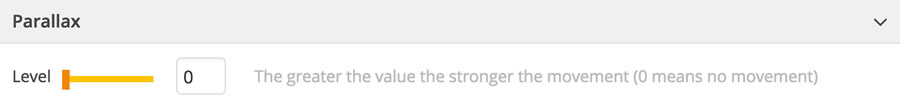
We've developed a parallax engine that allows elements to move at different speeds according to the mouse movements. To enable this feature you have only to set a parallax level to each element you wish to be moved (and of course the main parallax setting has to be on yes). Since the greater the value you specify the stronger is the element movement, to create a realistic effect you should set smaller values to far elements and greater values to the near ones.
Adding Interactivity
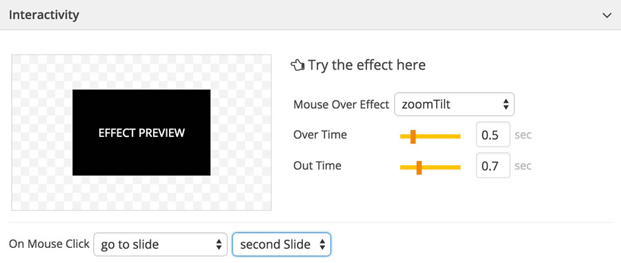
The last panel allows you to add interactivity to each element. You can set a specific effect to be executed on mouse over and its durations. Going with the mouse pointer over the black box on the left you can then see a preview of the effect.
You can also specify what has to be done when the user clicks on the element, choosing one of the following options:
- none: nothing happens
- open a link: you can specify an url and if it has to be opened in the same window or in a new one
- go to slide: select a specific slide to go to
- call javascript code: you can add your javascript code inside the enhanced editor that will be shown
Text Element Type
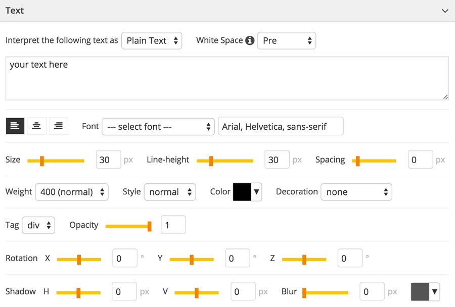
This panel allows you to set the text element properties. Here you can find a description of the settings displayed in this panel:
- Text/Html: the first parameter tells how to render the your text. The default value is Plain Text and it means that if, for example, you enter a text like <div> it will be rendered as text, so the div tag won't be interpreted. In this case you can specify the White Space option, to tell to the browser how to manage new lines. Even if choosing one of the available values require a good knowledge of the css, you shouldn't have to change the default value. If you choose html you can then enter html code and the slider will render it as expected
- Alignment: you can choose how the text is aligned inside its container
- Font: there are some settings to style your text as you prefer. The Font option allows you to select a standard font or a Google one (please take a look at the Google Fonts paragraph)
- Tag: the extension is SEO friendly and allows you to specify the tag type to use for you text
- Opacity: a value between 0 (not visible) and 1 (fully visible) for transparency
- Rotations: the text can be rotated along each 3d axe
- Shadow: it allows you to specify the shadow horizontal size (Shadow H), the vertical size (Shadow V), the blur amount and the shadow color
Image Element Type
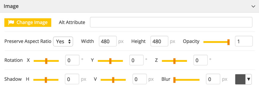
This panel allows you to set the image element properties. Here you can find a description of the settings displayed in this panel:
- Change Image: this button allows you to change the image choosing another one from a file manager
- Alt Attribute: to grant a better searchability to your images you can specify the description to be placed into the alt attribute
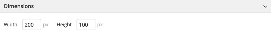
- Dimensions: you can change the image width and height both manually inserting the values or by resizing the image width the mouse (please see the Working Area paragraph). If you set the Preserve Aspect Ratio to true, when you change one dimension, the other one is automatically calculated based on the image ratio
- Opacity: a value between 0 (not visible) and 1 (fully visible) for transparency
- Rotations: the image can be rotated along each 3d axe
- Shadow: it allows you to specify the shadow horizontal size (Shadow H), the vertical size (Shadow V), the blur amount and the shadow color
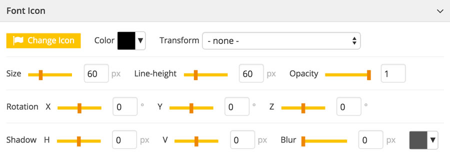
Font Icon Element Type
This panel allows you to set the font icon element properties. Here you can find a description of the settings displayed in this panel:
- Change Icon: this button allows you to change the icon. If you click on it a popup with all the available font icons (the extension uses FontAwesome 4) will be shown. Just click on one of them to choose the new one
- Color: the icon color
- Size: since the icons are font chars, you can set their size as you normally do for texts. So, specify a value in pixel for the Size and the Line Height (usually the same as the size)
- Opacity: a value between 0 (not visible) and 1 (fully visible) for transparency
- Rotations: the icon can be rotated along each 3d axe
- Shadow: it allows you to specify the shadow horizontal size (Shadow H), the vertical size (Shadow V), the blur amount and the shadow color
Youtube Element Type
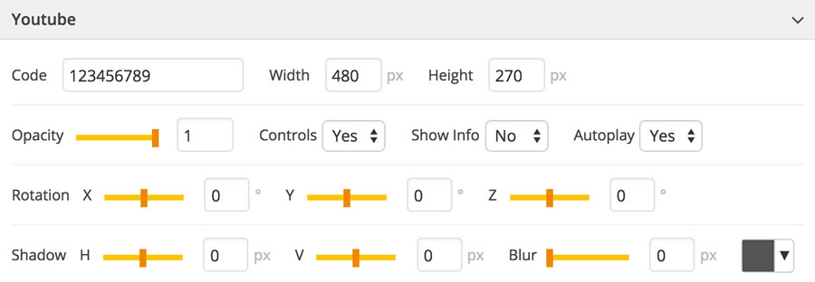
This panel allows you to set the Youtube element properties. Here you can find a description of the settings displayed in this panel:
- Code: this is the video code and you can find it in its url (i.e. https://www.youtube.com/watch?v=CODE)
- Dimensions: width and height of the video. Note that if you specify values with a different ratio from the video one, the Youtube player will show a black background to fill the empty spaces
- Opacity: a value between 0 (not visible) and 1 (fully visible) for transparency
- Controls: show/hide the youtube player controls
- Show Info: show/hide title and authors
- Autoplay: if set to yes the video starts playing as soon as it enter into the scene
- Rotations: the video can be rotated along each 3d axe
- Shadow: it allows you to specify the shadow horizontal size (Shadow H), the vertical size (Shadow V), the blur amount and the shadow color
Vimeo Element Type
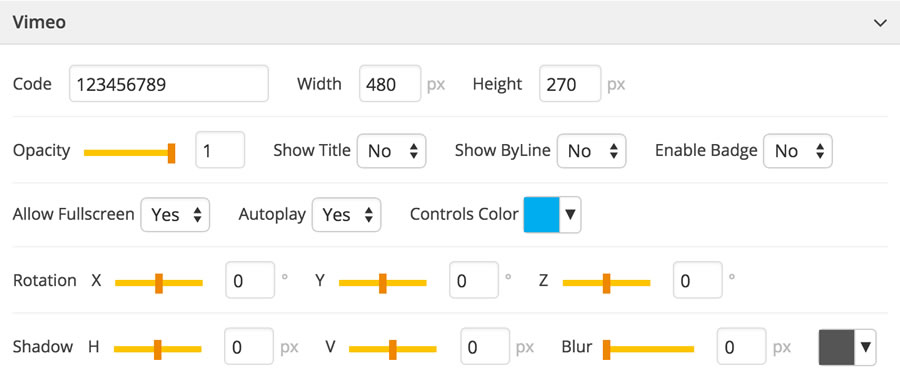
This panel allows you to set the Vimeo element properties. Here you can find a description of the settings displayed in this panel:
- Code: this is the video code and you can find it in its url (i.e. http://vimeo.com/CODE)
- Dimensions: width and height of the video. Note that if you specify values with a different ratio from the video one, the Vimeo player will fill the empty spaces with a background
- Opacity: a value between 0 (not visible) and 1 (fully visible) for transparency
- Show Title: show/hide the video title
- Show ByLine: show/hide the video author
- Enable Badge: enables or disables the badge on the video
- Allow Fullscreen: enables or disables the fullscreen features
- Autoplay: if set to yes the video starts playing as soon as it enter into the scene
- Controls Color: the colors of some Vimeo player elements
- Rotations: the video can be rotated along each 3d axe
- Shadow: it allows you to specify the shadow horizontal size (Shadow H), the vertical size (Shadow V), the blur amount and the shadow color
Html5 Video Element Type
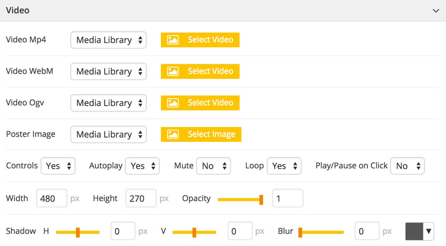
This panel allows you to set the Html5 video element properties. Here you can find a description of the settings displayed in this panel:
- Files: you can specify one or more video files (Mp4, WebM and Ogg - for a better understanding of the html5 videos we suggest you to read the w3schools.com description). You can both load them using a file manager or from an external url
- Poster Image: it specifies an image to be shown while the video is downloading, or until the user hits the play button
- Controls: show/hide the youtube player controls
- Autoplay: if set to yes the video starts playing as soon as it enter into the scene
- Mute: enable/disable the audio
- Loop: if set to yes when the video finishes it's started again
- Play/Pause on Click: if set to yes you allow users to stop the video by clicking on it
- Dimensions: width and height of the video
- Opacity: a value between 0 (not visible) and 1 (fully visible) for transparency
- Shadow: it allows you to specify the shadow horizontal size (Shadow H), the vertical size (Shadow V), the blur amount and the shadow color
Empty Element Type
An empty element consists only in the container element. To change its dimensions you can both manually set width and height or resize it with the mouse. To style the element please refer to the container panel.
Custom Element Type
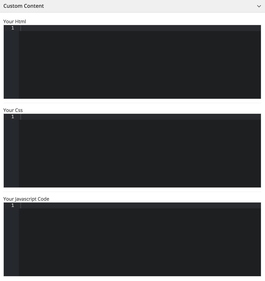
A custom element allows you to add your own html, css ans javascript code. Please note that since they are placed on the scene and shown dynamically we can't grant that every javascript code will work correctly.
Working Area
The Working Area allows you to have a look at where the elements of the current slide are placed and to move and resize them using the mouse or the keyboard arrows.
When you add a new element to the current slide, it has shown in working area and can be dragged with the mouse. Some elements (images, empty, etc.) can also be resized by dragging the white handle icon placed on the bottom right of the element.
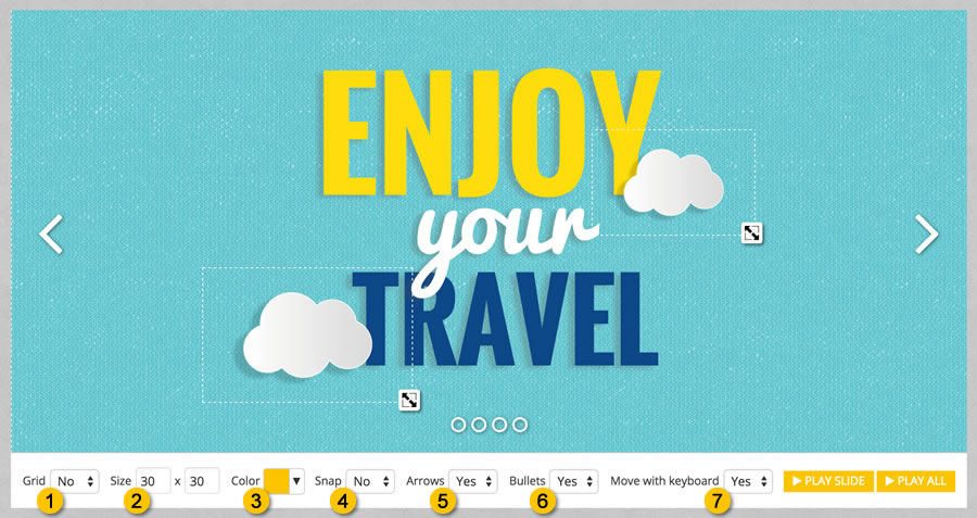
To allow you to easily align elements with each other we've introduced the grid (enable it in position 1) feature that shows horizontal and vertical lines over the working area. The line distance and color can be set by changing the values in position 2 and 3, while enabling the Snap option (position 4) the grid almost seems magnetic and when you move an element it will be aligned with the nearest line.
The options in position 5 and 6 show/hide arrows and bullets in the working area. The Move with keyboard option allows you to move the current selected element using the keyboard arrows. The two buttons PLAY SLIDE and PLAY ALL open a popup preview of the current slide or of the entire slider.
Slider Settings
On the top of the page you can find the Project Settings button. If you click on it some panel will be show. Each one of them allows you to control a specific group of settings.
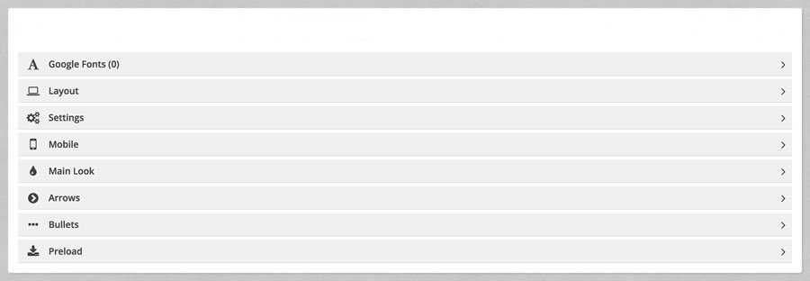
Here is a brief description of what they deal with:
- Google Fonts: a panel which allows you to add Google fonts
- Layout: it allows you to specify the dimensions of the slider, the slide backgrounds and the slide contents and their responsiveness
- Settings: the slider general settings
- Mobile: specific settings for mobile and tablet devices
- Main Look: here you can set the main background color and edit the slider css styles
- Arrows: here you can edit the position and look of the slider arrows
- Bullets: and here you can edit the position and look of the slider bullets
- Preload: it allows you to change the look of the preloader
Google Fonts
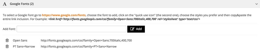
With this panel you can manage the Google Fonts used by your sliders. To add a new one go to the Google Fonts website, choose the font to add, click on the "quick use icon" (the second one), choose the styles you prefer and then copy&paste the entire link inclusion (for example: <link href='http://fonts.googleapis.com/css?family=Open+Sans:700italic,400,700' rel='stylesheet' type='text/css'>) and click on the Add button.
Now in the font list of your Text Element Panels you will see the added fonts. To delete a font just click on the trash icon on the left.
Layout
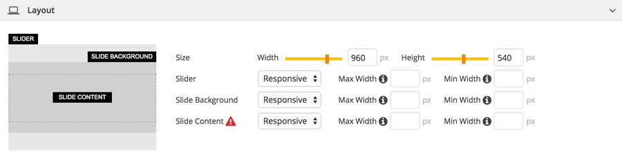
In this panel you can set the width and height of the slider and choose how its components have to be resized. The slider has composed by three main divs: the main container and the background and content of each slide. For each one of these three components you can choose how they are resized according to the browser window size. You can choose between a fixed size (this means that the component won't be resized anyhow) or responsive (you can also set a minimum and maximum width). The preview box on the left shows you how they work.
If you choose the full width option, width and height of the slider will be the same as the browser window dimensions. As you can see, choosing this option, some new parameters will be shown. The Subtract from Width and Subtract from Height parameters allow you to subtract some pixels from the slider dimensions. This could be useful if your website has fixed elements i.e. header, footer, sidebar, etc.. You can also specify if the slide background has to be resized covering the whole available space or contained maintaining its original ratio.
NOTE: in the main editor, the slide content is always fixed. If you need to see a real preview you can click on the PLAY SLIDE or PLAY ALL buttons.
Settings
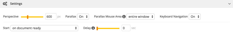
Here you can specify some general settings:
- Perspective: it allows you to change the perspective on how 3D elements are viewed (this is the css3 perspective property). The smaller the value the higher the perspective effect
- Parallax: to enable/disable the parallax effect - see below
- Parallax Mouse Area: if you choose entire window, the elements (with a parallax value greater than 0 - see below) will be moved based on mouse movements around the browser window. If you select slider mouse movements outside the slider boundaries won't move the elements
- Keyboard Navigation: to enable/disable the navigation using the keyboard arrows
- Start: you can specify when the slider has to start: when the contents become visible (i.e. scrolling), on window load (after all page contents have been loaded) or on document ready (after the HTML document has been loaded)
- Delay: you can also set a starting delay
- Visibility Threshold: if you choose to start the slider animations when it becomes visible on page, you can also specify a minimum threshold (in pixel). The slider animations are fired only if al least a height equal or grater than the threshold is visible
Mobile
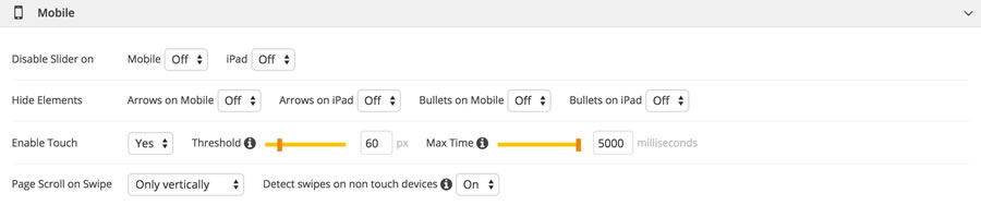
This panel allows you to set some specific settings for mobile and tablet devices. You can enable or disable the entire slide or some of its elements and enable/disable the touch feature (and you can also specify a pixel threshold and a maximum time for swipe detection).
With the Page Scroll on Swipe property you can specify if and how the page scrolls when you do a swipe over the slider. You can also choose to detect or not swipes made by the mouse.
Main Look

You can change the main background of the slider choosing between a solid color, an image selected from a file manager or from an url, or a transparent background. If you choose an images you can then specify how it has to be resized and repeated. This could be very useful for repeatable textures.
Arrows
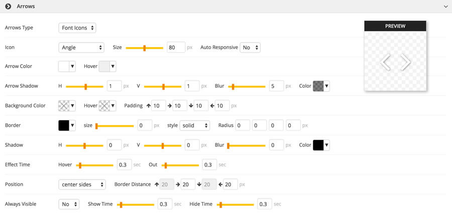
This panel allows you to change the aspect of the navigation arrows. The first property is the type of arrows (images, font icons - for fully responsiveness, or no arrows). If you want to use font icons, you can then choose one of the ready-to-use icons (the extension uses FontAwesome 4) and set their size, color, styles and the hover effect time. A realtime preview allows you to see the result. If the Auto Responsive property is set to yes the arrows are fully responsive and automatically scaled according to the slider dimensions, while if it's set to no they will have always the size you select.
If you choose image arrows, you are then prompted to select the left and right arrow images to load. Also for this type of arrows you can set the style.
In both cases the arrows have a container that can be skinned changing its background color (and how it changes on mouse over), padding, border and shadow. If you leave these setting blank your arrows will be shown without any background.
The navigation arrows can be places in different positions. You can specify where they have to be shown by selecting one of the predefined values and the border distance. While in the small preview window you can see how the arrows will look, inside the main editor you can see where they will be positioned.
If the Always Visible property is set to yes, the arrows are always visible, while if it's set to no they are visible only when the mouse goes over the slider. In this case you can specify the duration of the fade effect.
Bullets
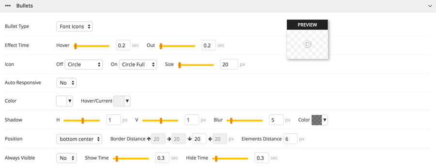
The bullets can be change in the same way as arrows. You can choose between font icons, images or to not show bullets. You can choose a ready-to-use font icon, set its size and specify if it has to be responsive. In such a case, you can also choose a minimum and maximum size. Some style settings allows you to give your preferred style to the bullets, choose the hover color and effect time and shadows.
The position select allows you to set the bullets position inside the slider and the distance between them. As for the arrows, a realtime preview of the bullets aspect will be shown inside the small window, while you can see their position insider the main editor below.
Preload
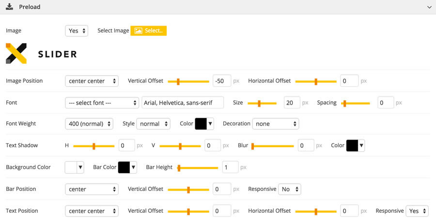
This panel allows you to change the aspect of the preload. You can choose your preferred font and its size, spacing, weight, color and styles of the percentage text, you can add a shadow to that text and choose a background color. You can then specify the position of the progress bar and the percentage text. If you want you can also add an image and specify its position.